

Plotting COVID-19 data during the lockdown was a big thing because people were trying to understand what was happening. I think that was a good occasion for a lot of people to get closer to the art of data plotting. I’ll describe my favourite toolset to plot data using a COVID-19 dataset as an example.
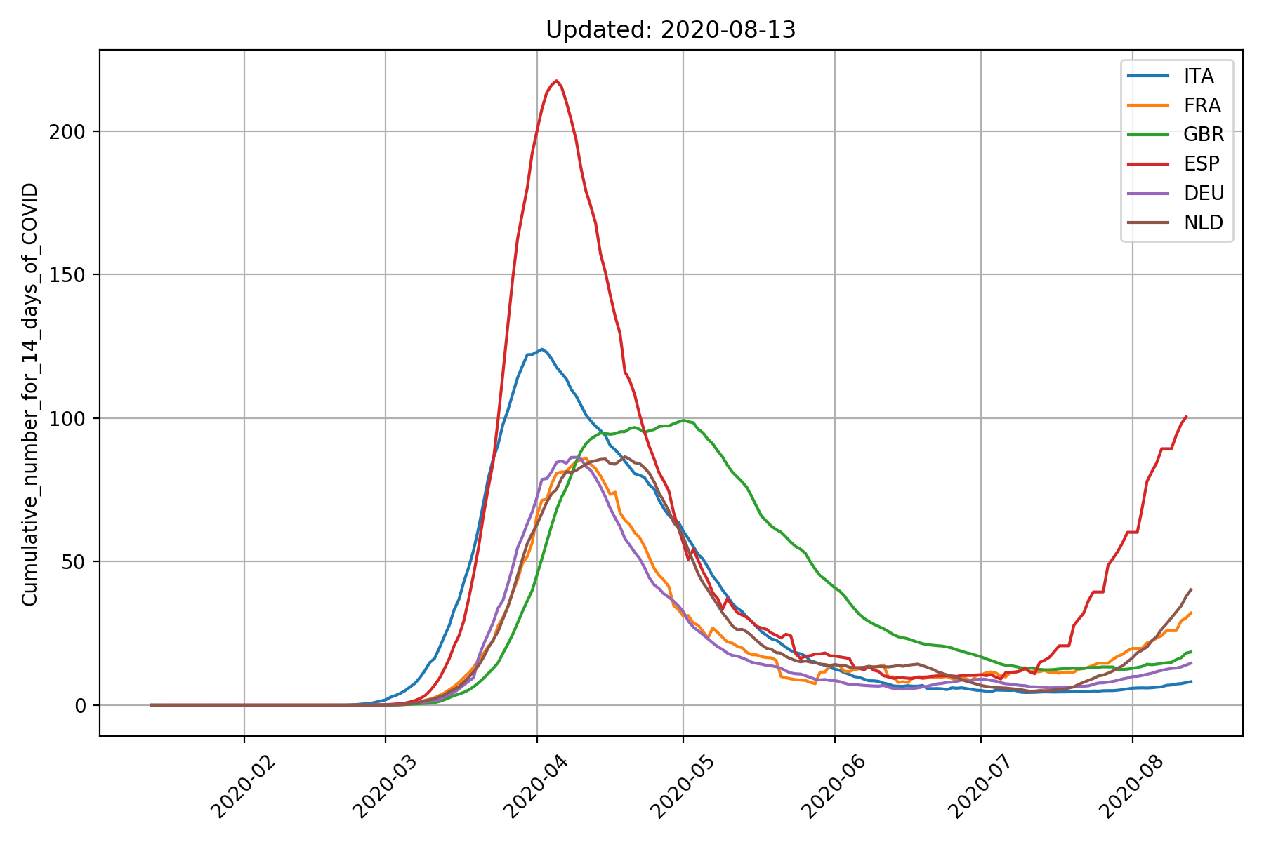
We’re going to use Python for this task, specifically a Jupyter Notebook. If this is your first approach to Jupyter, I’d suggest to install Anaconda Python, which is a Python distribution which bundles most of the modules you might need for data analysis. Ideally, I’d like to make a plot that looks like this using the Jupyter Notebook.
The big task can be split into smaller ones, according to a well-known strategy:
- Download the most recent data from a (reliable?) source
- Parse the data and make sense of it. For example, filter the data and keep only the information we need
- Plot the data, possibly with an interactive tool
Let’s import some Python modules which we’ll use later on.
import datetime                     # Manage the date type
import requests                     # To download the data
import pandas as pd                 # To load the Excel file
import matplotlib.pyplot as plt     # and make plots!
The datetime module is part of the Python standard library while the others are third-party modules. The requests module let you download data from the Internet easily. I’m very keen on Pandas, which I discovered recently, because it makes dealing with data very easy. Last but not least, Matplotlib is an amazing module to make high-quality plots.
The data can be from many sources and when it comes to COVID-19, we have plenty of choices for our data source. I’m going to use the Excel spreadsheet provided by the European Centre for Disease Prevention and Control. They provides the number of cases, deaths and cases-per-100000-inhabitants for many countries. Specific countries are identified by their name or country code.
The url for the Excel data is https://www.ecdc.europa.eu/sites/default/files/documents/COVID-19-geographic-disbtribution-worldwide-2020-08-13.xlsx where the last part involving year, month and day can be changed to obtain the most recent data. To get the data from yesterday, we can run:
yesterday = datetime.datetime.now() - datetime.timedelta(days=1)
when = yesterday.strftime("%Y-%m-%d")
url = r"https://www.ecdc.europa.eu/sites/default/files/documents/COVID-19-geographic-disbtribution-worldwide-{}.xlsx".format(when)
Downloading the Excel data can be achieved easily using the requests module. The contents of the webpage are stored in memory, so no file is actually written to the disk.
data = pd.read_excel(excel.content)
I’ll focus on few countries only and I’ll specify which ones with a Python list.
what = [
    "ITA",
    "FRA",
    "GBR",
    "ESP",
    "DEU",
    "NLD",
]
At this point, we can plot the curves of cases for each country we’re interested in. We’ll filter the data by selecting the rows whose “countryterritoryCode” column contains the country id we specified.
for country in what:
    country_data =  data[data["countryterritoryCode"] == country]
    plt.plot(country_data['dateRep'],
             country_data['Cumulative_number_for_14_days_of_COVID-19_cases_per_100000'],
             label=country)
At the end, we can specify some labels and legend for the plot.
plt.title("Updated: {}".format(when))
plt.xticks(rotation=45)
plt.ylabel('Cumulative_number_for_14_days_of_COVID')
plt.legend()
plt.grid('on')
plt.tight_layout()
plt.show()
The final result should look like this. The actual Jupyter notebook can be downloaded from here.
Attachments
| File | Description | File size | Downloads |
|---|---|---|---|
 COVID-19 Stats
|
|
161 KB | 263 |
Leave a Reply